


Inflation Update

Inflation numbers for August are out, and they are really interesting, and not really in a good way. Before we get started it might be useful for some to have a little inflation 101. It can be a confusing subject, and to really understand the trends happening now I need to use a few terms that some people might not be familiar with.
CPI - The Consumer Price Index is the average price of a whole set of goods. Basically you can think of this as the “on the shelf” price of stuff. It is a general measure of prices as they exist during the time period being measured. Prices ordinary people see are the real drivers of CPI—sort of the out of pocket costs for consumers. CPI focuses mostly on urban prices.
PCE - Personal Consumption Expenditures is another way to measure inflation. Rather than data from consumers this relies on data from businesses. Rather than the out of pocket cost changes, PCE focuses more on the change in goods or services consumed—slightly different, but it is a meaningful difference. PCE also measures the price for all households.
The difference between CPI and PCE is subtle for anyone who isn’t a nerd. “Out of pocket costs for urban consumers” vs “goods and services consumed by all households” might sound like the same thing, so I’ll explain a bit further. Since CPI relies on a set of goods—called a basket—it measures pretty much the same things every time. This way it asks “what is the change in the price of the basket from the last measurement.” That is the out of pocket part—how much more are consumers paying for their stuff. But, what if you just stop buying some of the stuff? If hot sauce goes from $1 per bottle to $6 per bottle, that will be reflected in CPI, but a lot of people might stop buying hot sauce, or switch to a cheaper alternative like salsa. But, $6 is still the price of hot sauce, so it shows up in CPI
PCE is a little better at catching the switch from hot sauce to salsa. Some people will still buy hot sauce, and salsa prices probably went up too but by a smaller amount. PCE tries to capture this difference in personal consumption. Though most news headlines focus on CPI, most economists—including, generally, the federal reserve—prefer PCE because it’s a bit better at reflecting the actual increase in costs people face given the choices they make. CPI is better at answering the question of the increase in costs people would face if they didn’t change their purchasing choices when prices go up. I’m trying not to get too technical here, and this definition is one that might make some people grumpy, but it is simple and near enough to the real definition that ordinary folks are safe to think about it his way.
Headline vs Core - Headline inflation, whether CPI or PCE, is the overall number of the full measurement. It includes all the stuff from all the places. Core inflation looks only at the prices for things that monetary or fiscal policy can have a more immediate impact on. Generally, this means core inflation measurements do not include energy or food prices in their measurements. The Fed changing interest rates or adjusting bond buying (monetary policy), or Congress passing a law about taxes or spending (fiscal policy) can really impact core prices. The Biden administration has provided a good example of this with the infrastructure and inflation reduction packages passed this term. These have, and will have when they get rolling, a serious impact on the price of things like prescription drugs, solar panels, heat pumps, electric cars etc.
This is less easy to do with gas prices and food because of the volatility in both supply and demand. If wildfires, hailstorms, or floods wipe out a bunch of crops, prices will go up no matter what policymakers do. If a random guy digging in Nevada finds access to a massive oil reserve, gas prices will go down no matter what because there is new supply. When Russia invaded Ukraine it took supply of both crops and oil away from the market, so these prices went up quickly. So, core inflation doesn’t measure these things. As we will see, this makes a big difference.
Month over Month - This is more simple, and is just what it sounds like. How much higher or lower are prices now than they were 30 days ago?
Year over Year - I’m sure you can guess this. How much higher or lower are prices now than they were 365 days ago?
There was a good bit of fighting about MoM vs YoY inflation last month when the numbers for July showed 0% inflation. That was the MoM number—prices hadn’t changed in the last 30 days. The YoY number was still pretty high because the price changes from July 2021 through June 2022 are still measured in the YoY number. I’ll give more detail about this once we get stuck in to actual inflation numbers.
Disinflation - A slowdown in the rate of inflation. So, if inflation was 10%, but now it is 5%, we have 5 percentage points, 50% in this case, disinflation. Prices are still growing, but they are growing at half the speed they were.
Deflation - A negative number for inflation change—meaning prices actually fall.
The final thing to understand is that inflation, whether CPI or PCE, is an actual number, not a percent. The inflation rate, both MoM and YoY, is the change in that actual number from the previous month or the previous year. This becomes important when thinking about YoY vs MoM and when thinking about whether inflation is still a problem. The MoM and the YoY are just different rates for the same inflation index. The Federal Reserve officially targets 2% as the preferred interest rate, and when they do this they are referring to Core PCE as their benchmark.
Now, let’s get started.
I hope you’re enjoying this letter so far. You can subscribe to make sure to catch every edition of The Constituent. It’s completely free!
It might be useful to look at these two graphs that show you the actual index number for CPI and PCE. I am only going back 10 years with these graphs because I want you to focus on the trend to target, and going back too far makes this less meaningful. 10 years is a long enough time frame to see longer term trends, and it captures pretty much all the growth period following the Great Recession. PCE numbers for August are not out yet, so I’m just going back one month for PCE. Final note for the very careful readers out there, I’m using chained indexes so that PCE and CPI can be compared on the same graph without scaling or using a dual axis.
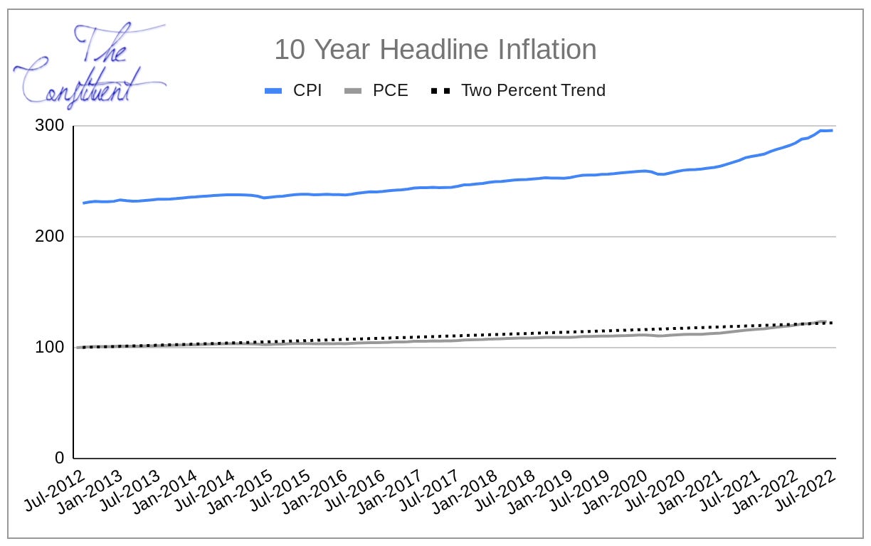

Visually, these graphs don’t really make inflation look like a big deal. But it is, and it only looks this way because this is a 10 year timeframe. Take a look at the two year timeframe for reference.


For reference I added the 2% target line for CPI in the two year windows, even though the Federal Reserve mostly looks at core PCE. Here it’s clear how much the indices—the actual CPI and PCE numbers—have increased during our current inflationary period. You should notice these indices have solid numbers, not percentages. The percentages you often see reported are the changes in the index from one month or one year ago. You should also notice that core inflation has been closer to the 2% target than headline inflation. This is pretty normal, and part of what makes this month so different.
The percent change shows this even more clearly.

Year over Year inflation is high, and well above two percent, even for the Core PCE that the Federal Reserve targets.
So, the headline CPI for August was 8.3% YoY, and 0.1% MoM. The good news is that this is clear disinflation, the bad news is that it’s mostly because of falling gas prices. Core CPI came up from 5.9% YoY in July to 6.3% YoY in August—a 0.6% increase MoM. That suggests that prices at the store are still rising and the otherwise good numbers are just due to prices at the pump falling. This is a fairly strong indication that inflation hasn’t gone away—and I wrote a few weeks ago about where the data points its finger for blame.
When headline inflation is much higher than core inflation it suggests the problems are something that might naturally smooth themselves out with a little push from policymakers. But the data now looks like headline is trending down while core is trending up—that’s a really worrying trend. It may be an aberration, and may not hang around for long, but if it does it could mean much bigger trouble than our high summer gas prices.
One of the biggest drivers of this core inflation is rent or owner equivalent rent (basically mortgage payments). The huge increase in housing prices has started to flatten out, meaning there is disinflation in housing; however, rent seems to be different. Rent prices are going way up, and it isn’t entirely clear why. During the pandemic a lot of people wanted to move for remote work, and they were willing to pay high home prices, especially because few people were selling. That was the cause of housing inflation. Now that the number of sellers is closer to the number of buyers, and that mortgage interest rates are rising, people are less willing to pay the high prices for a house.
The best explanation I have heard for rent inflation is that more people wanted to ditch their roommates during the pandemic, which increased demand for rent. Many renters are also renting houses, and if the house was bought while housing prices were going up, the rent must go up to cover that additional cost. Add on to that the huge companies who are buying property from homeowners for the purpose of renting (there is almost always a monopoly angle) and the rent inflation is still hot. Since incomes haven’t kept up with inflation, it would be reasonable to expect people to begin looking for roommates again because their rent as a percent of income is higher than they thought it would be a year ago. If this is the case rent should deflate somewhat, but this isn’t a guarantee given the trend toward market concentration of landlords.
Having fun? Learning something new? If so, do me a favor and let your friends know about The Constituent.
So, how the Federal Reserve plans to fix this problem is a secret they are being pretty tight lipped about. All we really know is they are aggressively raising interest rates to do so. There are two ways to think about how we get back toward the 2% inflation target.
If the target is 2% YoY inflation, then any MoM inflation under 0.166666% gets toward that goal. The Federal Reserve initially said they wanted a “soft landing”. While they didn’t say exactly what a soft landing means, one reasonable way to interpret this is to target MoM inflation. So, if MoM inflation came in at under 0.3% for 6ish months and around 0.1% for another 6ish months, then YoY inflation would be pretty close to the 2% target. The problem is this obviously takes a year.
In the Two Year Headline Inflation graph above, this keeps the blue line increasing, but it increases less than the dotted red line. Meaning prices disinflate until they reach the long term trend goal. If this were doable it would likely mean no recession is needed to get inflation under control.
There are two problems with this: first, consumers might get impatient or might begin to expect inflation. Higher inflation expectations generally lead to higher inflation because people change their behavior when they expect inflation. This hasn’t really been a problem so far, but with core inflation rising it may become a problem. Second, political interests might get impatient. Yes, inflation was 0 in July and 0.1% in August. If we get a third consecutive month in the 0-0.1% range President Biden could accurately make the claim that “at the current trend inflation will be back down to the target 2% in less than a year”. This would suggest, accurately, that the inflation problem has been solved.
But solving the inflation problem doesn’t solve inflation.
This might not make sense, so let me explain. Most people seem to conceptualize inflation as the YoY measurement. If MoM is small that means the actual CPI or PCE indices are rising slowly—so the inflation problem is gone. But, prices would still be a good bit higher than they were a year ago. So, the YoY number would still be high until there was 12 months of this disinflation. The YoY number would keep getting marginally smaller, but it would stay high until the disinflation can be measured against itself—and that takes a year. So, people might still see inflation in the high 6% to low 7% range YoY until next summer. It might be enough to squeak out an election bump since the three month trend would be so close to the November election, but it might not be enough to actually convince people inflation is gone for the 9 or so months after that.
If this disinflation strategy doesn’t look good for the Fed (and only they know what they are thinking), option two is to pursue deflation through even more aggressive rate hikes than they have been using. Federal Reserve Chair Jerome Powell has been sending the message that solving inflation might take some pain. The ‘pain’ would likely be a small recession. This is actually preferable from an economic standpoint—depending on how one defines a small recession. If we define it as 5 or 6 percent unemployment, this is better than high inflation. High inflation impacts everyone, but the recession would mostly just impact the 1.5 to 2.5 percent of workers who would become unemployed (unemployment is roughly 3.5% right now). This sucks for the unemployed, but it’s overall better for the economy. Adjusting unemployment benefits or other automatic stabilizers can also help those who suffer in a small recession.
It is possible that the Fed is trying to take the low MoM inflation rout—disinflation—and they just don’t want people to know this. If people knew this to be the case they might think, “The Fed thinks inflation is largely over, so it must be over”. This would cause people to change their behavior in a way that might actually make inflation worse. I’ve been clear that greed from monopolistic corporations is driving a big part of inflation. If corporations are afraid the Fed might actually cause a recession, they might lower prices—deflation—to avoid taking larger losses in a recession.
But, the Fed is pretty secretive for a reason. Obviously, if we knew what they were thinking we could all change our behavior to align, and that might ruin their strategy. For all we know this new report, with its increase in core inflation, might have just convinced the Fed that real deflation is the answer—even if it causes a recession.
Thanks for reading The Constituent. If you’d like to support the newsletter, here are a few options.
-Thanks,
